We all know how draining it is to be faced with an email, report or website that is chocablock with text.
Paragraph after paragraph, page after page of facts, numbers and buzz-words can be intimidating.
And for many people, it can be unintelligible.

Source: Giphy
But, when your business is technical, your services are complex and your industry is full of jargon, how can you avoid a word tsunami?
Enter: Graphics
The most effective way of conveying information quickly and easily is through visualisation. A good graph, chart or infographic can not only capture the attention of your audience, but it can help them understand your content more easily and [HUZZAH] help you cut out whole paragraphs of excess wordage.
Thankfully with so many tools now readily available to create visually beautiful graphs and infographics, businesses have begun the move away from text heavy tomes and towards more visually appealing ways of displaying their content.
I, for one, am cheering on this movement.
But, and this is a BIG but, I heed thee a word of warning: while these graphics may look pretty, they are only helpful if they are done well.
I know, I know, it is tempting to find a free infographic tool, get excited that someone else has created a template for you and to just whack it in your next report.
However, before you ride the train all the way to Giddy Town, get off at the next station and take a moment to consider risks of having a bad graphic.
A bad graphic such as… one that looks nice, but means nothing OR one that doesn’t mean what you intend it to OR one that alienates your audience.

All of these can risk your brand's authenticity and your authority over the subject matter.
John Doe
The nuts and bolts of it
My above warning is not intended to scare you away from the world of corporate graph making.
My warning is simply to say that, like with most things in life, using graphics requires a little bit of thought before you take action.
A big part of my business is communication design – helping people translate their key business information into formats that their audience can actually understand and want to read. I take company goals / strategy / processes / service offerings, remove all the jargon and buzz-words, and create beautiful, meaningful graphics for their documentation, websites, email newsletters etc etc.
I also spend a lot of time fixing other people’s infographics 😅
And from my experience, I have found the key elements for what makes a graphic truly successful.
For data visualisation to be truly effective, these are the top 3 things you should consider:
1. Select your your information thoughtfully
The first step in creating effective visual content is to understand your data and select only the relevant data to display (irrelevant or long contextual data can go elsewhere, for example an appendix… or the bin).
When selecting your data, you need to intimately know what your audience wants to know and what it means for them. It is also helpful to think of how your audience will use this information too.
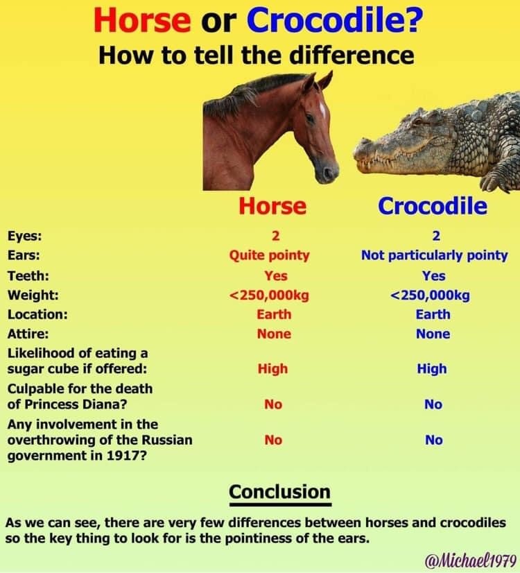
Comparing irrelevant data can have dangerous results
2. Select your display type with intent
There are millions of ways to display your data, but selecting the right display type for your data and your context is essential.
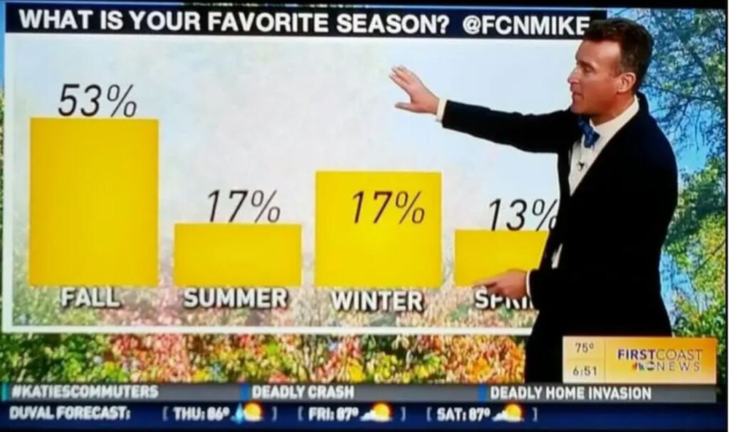
For example, if your data is number based, you might like to choose a graph. If so, what type of graph? Do you need to compare two sets of numbers or just one? Which content should be on the X-axis?
Data labels and sizing all add to the effectiveness of a graphic
Think laterally, and consider a move away from the traditional graph. How else can you display your data? Could it be a pictogram, map or infographic?
After selecting your visual type, always take a step back from your graphic and check that the way you’ve selected to display your information will actually make sense to the audience.

Tip: Always get another set of eyes to check the readability of your graphic
3. Design it wisely
When choosing the visual design elements of your graphic, consider where it is going to be situated (eg. print or digital) and also who is going to read it (eg. their age, abilities, level of subject knowledge).
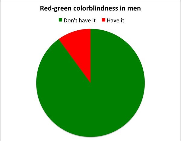
Using visual clues can help give your graphic ‘the edge’. Try using icons in lieu of words, colours that evoke meaning and different sized elements to demonstrate the comparative difference.
Using your brand colours and brand fonts in the graphic can also help create professional looking designs.
In addition to making it look pretty, your selections here will make a big impact on the success of your graphic.
Audience appropriate visuals are essential
Graph well, my friend
By following my 3 steps above, you will soon be on track to making your own successful and engaging graphics guaranteed to boost your business documents and win your more business.
Need further support?
Well, I’m glad you asked, because my 4th recommended step is to call me at Crisp Communications and let us take care of all your graphic needs for you.
If you have any questions – please get in touch!
Stay Crispy, xo Abi